If you’re a marketer conducting research in advance of an upcoming website build, you may have heard the terms data-driven design, data-informed design, UX design, and user-centered design batted around.
For the uninitiated, this can be a bit confusing.
TABLE OF CONTENTS
- How data-driven design works
- B2B data driven website design: best practices
- Tools
- Analyzing data: common symptoms of UX issues
- Conclusion
In brief:
- Data-driven design uses quantitative (objective) data to inform design decisions.
- Data-informed design uses qualitative (subjective) feedback to inform design decisions.
- Data-aware design uses data as one factor used to inform design decisions.
Where data driven website design focuses on gathering objective data from analytics, testing, and surveys, data-informed design focuses on gathering more subjective feedback on user experience.
Data-aware design maintains that data is one of several sources of useful information.
Its approaches all follow the philosophy of user-centered design.
- User-centered design focuses on user experience when making design choices.
UX design is a set of strategies that puts the user-centered design philosophy into practice.
- UX (user experience) design is a set of strategies that strive to optimize user experience.
Just as inbound marketing strives to be helpful to the customer to earn and maintain their business, all of these terms that end with “design” try to maximize user experience to keep visitors on your site, and encourage them to convert into leads.
As a result, understanding how users interact with your site and tailoring it to meet their needs can have very real effects on lead generation. Research shows that "every $1 invested in UX results in a return of $100 (ROI = 9,900%)" (UXCam)
In this post, we’ll discuss design informed by data to some degree (driven, informed, or aware): how it works, best practices to implement on your website, tools to gather data, and red flags in data that may uncover design issues.
How data-driven design works
Your website is a tool, and one of its primary uses is to generate leads for you.
Of course, employing data-driven design doesn’t mean that you should ignore your intuition and creativity as a designer.
Instead, it combines your artistic sense with hard data about how your audience thinks and behaves so that you can make more informed decisions that are both beautiful and functional.
Rather than guessing about what your audience wants or likes, your research can provide educated guesses and facts about how your site visitors actually interact with your website.
This can help you identify what you're doing right and help you do more of it. It can also help you discover near misses leaking opportunities and plug the hole.
Since data driven website design focuses on objective data, it requires research. Four common ways to gather data are using 1) analytics platforms, 2) A/B testing, 3) usability testing, and 4) surveys.
- Analytics platforms capture volumes of data about how users interact with your site.
This includes which pages are viewed the most, which routes users took to get to your page, how long or how much they engage with pages, where they clicked, and more. - A/B testing tools allow you to create different versions of web pages or elements and test to see which one users like better.
- Usability tests reveal how easy or difficult it is for real people to interact with your site.
These tests often involve asking participants to complete different tasks on a website while a researcher watches, noting where and how they struggle. This helps identify design problems. - Surveys ask customers directly for information about what they do and don’t like.
Some survey questions are close ended, seeking yes or no answers for quantitative information, while other questions seek qualitative information about a particular user’s experience, such as likes and dislikes.
B2B data driven website design: best practices
1. Understand the basics of data gathering
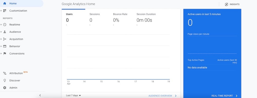
Source: Google Analytics
In order to make informed design decisions, you need to understand how to gather and interpret data from analytics platforms, tests, and surveys.
You can go about this a number of ways, such as by working with an analytics expert, reading articles, or taking an online course. Here are some resources you might find useful:
- Google's Use Google Analytics to Meet Your Business Objectives course (It’s free.)
- The Interaction Design Foundation’s “User Experience (UX) Design”
- UX Collective’s “Becoming a Data-aware Designer”
- UX Planet’s “This is all you need to know to conduct a UX survey”
- Designing with Data by King, Churchill, and Tan
- Hotjar’s “Beginner’s Guide to Usability Testing”
- Interaction Design Foundation’s usability testing course
- Interaction Design Foundation’s user research course
2. Identify your buyer personas
In order to better understand and empathize with potential customers using your site, you’ll want to put together buyer persona(s). This is a fictional representation of your ideal customer.
To create this character, talk to real customers who use your site and/or look at data about site users gathered from surveys, feedback, testing, and analytics.
Another great way to learn about your buyers is to talk to people in your sales or customer service departments who work with customers and prospects directly.
In your persona, include information such as:
- Pain points (dealbreakers or dealmakers)
- Needs
- Frustrations
- Goals
HubSpot has a free template that helps you put together a buyer persona quickly.
Coming up with one or more buyer personas will help you select participants for usability studies so that you have a more accurate idea of how your real users will react to your website designs.
3. Gather data scientifically
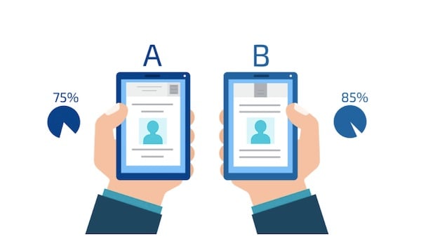
Source: Crazy Egg
In their book Designing with Data, King, Churchill and Tan lay out a process for setting up user experience experiments:
- Establish a goal
- Identify obstacles to achieving that goal
- Form a hypothesis
- Perform a test
- Analyze the results
Aaron Gitlin sums up what makes a good hypothesis this way:
“A hypothesis should clearly state and include:
The segment of users to be evaluated [user group]
The change we are making [change]
What we believe the result will be [effect]
Why we think that result will take place [rationale]
And finally, the measurable result we expect to observe [measure]”
To come up with a good hypothesis, pull from whatever data you already have about your users and follow King et al’s template:
“For [user group(s)] if [change] then [effect] because [rationale], which will impact [measure].” (King et al)
For example, a hypothesis might be:
“For [our Buyer Bonnie persona], if [we use a single CTA on our landing page rather than three] then [more users will convert] because [it will represent a more clearly defined next step], which will impact [our landing page’s conversion rate].”
Next, run a test that suits your needs, controlling variables just as you would in a true scientific experiment.
For example, Let’s say you perform a split, A/B test that shows half of your users a version of the page with multiple CTAs, and the other half a version of the page with a single CTA.
During this experiment, you wouldn’t want to change anything else on your landing page, such as the color scheme, because you wouldn’t know which changes affected the experiment’s results, or how much.
Finally, analyze the results of the experiment and interpret what changes you need to make to your design.
For example, let’s say that you achieve a higher conversion rate on the landing page with a single CTA.
A logical next step might be to use the single-CTA version of the page on your website. How you use the data you gather will depend on the context and size of your experiment. For more details on running a UX experiment, check out this article.
For tips on collecting data scientifically using a survey, check out this article.
4. Incorporate testing into your ongoing marketing strategy
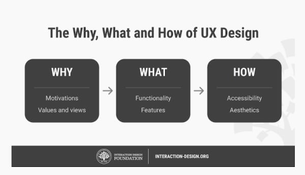 Source: Interaction Design Foundation
Make testing a habit, and you may be able to nip many UX issues in the bud, saving both time and money: “Fixing a problem in development costs 10 times as much as fixing it in design, and 100 times as much if you’re trying to fix the problem in a product that’s already been released” (UX Planet).
Of course, if you run regular tests, you will probably need to make regular changes to your website.
To make tweaking your website easier, use a flexible content management system (CMS) like HubSpot, Webflow, or WordPress.
Using a content management system on your website means that you can edit your website without getting a developer involved every time.
Say you ran an A/B test on one of your pages and found that the CTA copy “get in touch” got more clicks than the copy “contact us.”
With a flexible CMS, you could edit the copy “get in touch” much like you would a document, and publish your changes immediately with minimal fuss.
4. Consider UX when gathering survey data
When conducting surveys, consider the experience of your participants.
- Keep surveys short (10-15 questions) so they are more likely to be completed.
- Be careful about incentivizing users to take a survey, since it might bias your results.
- Be sure to thank your survey takers when they complete the survey.
5. Consider mobile-first design
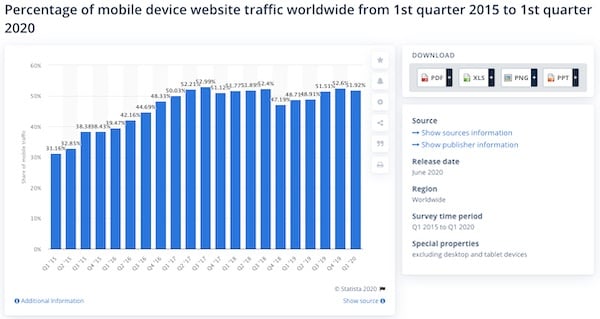
Source: Statista
It has become critical for B2Bs to have mobile websites that are as great as their desktop versions.
In 2020, mobile devices make up a little over half of web traffic in the world, and in 2018, “50% of B2B queries were made on smartphones” (Smart Insights).
Google now analyzes the mobile versions of most websites first, which means that it grades your website (which effects how high you rank in search results) based on how good your mobile site is.
As a result, many businesses employ mobile-first design. This means that you design your site with how it will appear on mobile in mind, and then adapt that design for desktop.
Doing this helps ensure that your mobile site is as user-friendly as possible, and that you’re showing Google the best version of your site.
Tools
There are many tools for gathering UX data, including various analytics, A/B split testing, usability testing, and survey tools. So how do you use them to improve your B2B’s website design?
Analytics tools: These tools are great for gathering loads of data in real time as users interact with your site.
Monitoring analytics data for red flags via tools like Google analytics make it easier to spot issues such as slow loading speed, broken calls to action, and 404 errors (unreachable pages) as they crop up, year-round.
A/B split testing tools: These tools are great for running experiments to test the effect of specific design choices on a web page.
For example, to know whether changing the color of the call to action on a landing page from blue to orange has any effect on conversions, you could create a split test with two versions of that web page: one with a blue CTA, and one with an orange CTA.
Next, you could show half your site visitors the blue version, and half the orange version within a set time period.
After concluding the experiment, you could then see if the orange button prompted more, less, or an equal amount of conversions than the blue button, and by how much.
This can be helpful when you’re choosing which version of a design to implement, especially in situations where a poor design choice could cost your company money.
Usability testing tools: Usability testing allows you to test how well users are able to navigate your website and perform tasks (such as searching for information) on a finished website or prototype.
Usability tests can be conducted in person or remotely using third-party software.
You can also set up tasks for users to perform without a moderator (and view a recording of the session later), or you can watch users interact with a site in real time (a moderated test.)
Usability testing is great for identifying weaknesses in an existing design.
Survey tools: Survey tools give you the opportunity to gather UX feedback directly from your site users after they have used your site.
They are excellent for gathering qualitative feedback like preferences (e.g. “do you enjoy our mobile deposit feature on our mobile app?”) and quantitative feedback, like answers to yes/no questions.
Tools to check out
Here are some popular analytics, A/B testing, user testing, usability testing, conversion optimization, and survey tools to help you fine tune your site.
- Google Analytics (analytics and A/B testing)
- Hotjar (analytics and user testing)
- Crazy Egg (analytics, user testing)
- HubSpot (A/B testing, analytics)
- Optimizely (A/B testing, website optimization)
- VWO (A/B testing, conversion optimization, user feedback)
- Lookback (Usability testing)
- Userlytics (Usability testing)
- UserTesting (Usability testing)
- Survey Monkey (survey tool)
- Google Forms (survey tool)
- Typeform (survey tool)
Analyzing data: common symptoms of UX issues
Usability tests allow you to learn where and how users struggle in real-time. Surveys give users the opportunity to tell you directly. But analytics data offers an indirect, quantitative window into your user’s struggles.
Certain analytics measures often point to specific UX issues. Here are some common red flags in your analytics and possible culprits.
Slow page load speed
If you see this issue, ask:
- Are your images the right size? > Make sure images are only as large as they need to be for the size of your page on the widest screens your users use (typically 2000 pixels), and that you use compressed file formats like WebP when possible.
When it's not, JPEGs should be used. JPEGs are generally lower weight than PNGs, which means they are less likely to slow down your page speed. - Are there large media files, such as videos and animations? > Convert video files to a more efficient format, such as WebM or MP4.
It could also be: making efficient use of caching, lots of HTTP requests, not compressing files, not using CDN, or a poor quality host (for example, your site has to share resources with another site or customer service is bad).
All of these issues require a certain amount of expertise to fix.
To diagnose exact issues, you can run your web pages through Google’s PageSpeed Insights for free.
For more page speed best practices, check out this Moz article.
High bounce rate
High bounce rates can be normal depending on their context, but are usually a cause for concern. Bounces occur when a user views only a single page of your website before leaving.
For example, let’s say a user fills out a form on a landing page, but they are not taken to a thank you page after they submit. Visits to this page, even ones that result in conversions, will be recorded as bounces even though nothing is wrong.
However, for most pages on your site, especially those that are designed to lead visitors deeper into your site, like your homepage, a high bounce rate is a red flag.
SEJ defines a higher-than-average bounce rate for an entire website as somewhere between 56–70%. Average bounce rates also vary by industry, and website type.
If you find that you have a high bounce rate on pages that should be leading potential customers deeper into your site, check for these common issues:
- Is the page loading too slowly? > Follow the site speed tips in the previous section.
- Is the design pleasing and up-to-date? > If your design looks outdated, unappealing, or unprofessional, visitors may be less likely to stay on your site. It’s a good idea to periodically update your site to reflect current website design best practices for your industry and ensure it's as user-friendly as possible.
- Does the page include interruptive ads? > Visitors may be annoyed by pop-ups and leave. It may be a good idea to replace the pop-ups with less intrusive CTAs.
- Is your site secure? > If your URL begins with “https” your site is secure. If it begins with “http,” it is not. Secure sites reassure visitors that their information is safe and contribute to your search rank. Look into securing your site.
- Is the copy hard to read? > Modern website users tend to skim pages and read only the sections that are most relevant to them. If your copy is hard to skim, it may need to be revised for clarity and structure.
To make copy easy to read, break it up into short sentences using easy words and paragraphs of 5 lines or less (lately, I shoot for <3 lines). Organize the page using a nested hierarchy of headlines and sub-headlines. Use bullet points and numbering to organize lists. Learn essential copywriting best practices.
High traffic but low conversion rate on conversion-focused pages
Landing pages are designed to make potential customers take a next action (conversion) such as signing up to receive emails, submitting a form, or making a purchase.
This is prompted by a call to action (CTA) like “subscribe to our email list,” “get it touch,” or “start your free trial.”
To ensure your landing pages are doing their job, it’s a good idea to set up “goals” in Google Analytics to measure the conversion rate on your landing pages.
A conversion rate is the percentage of people who land on a given page and take a desired next action, or “convert.”
A desired next action (or "conversion") in this case might be a form submission, resource download, or even a click-through to a lower-funnel page on your website.
Here’s a Google help page that walks you through the conversion tracking process.
Look at the conversion rates for each landing page. Are there any that have a much lower conversion rate than the others?
If your landing pages have an unusually low conversion rate, take a closer look at their calls to action. When looking at your designs, ask:
- Is the CTA relevant to the user? > CTAs should be relevant to the content of the page, the inferred wants and needs of the user, and represent a logical clear next action toward conversion. Make sure your CTAs check all three of these boxes.
- Is the CTA design stale or overused? > Even great CTA designs lose their shine after extensive or prolonged use. If you haven’t updated your CTA design lately, it might be time to refresh it.
- Could the CTA annoy the visitor? > Certain types of CTAs, such as pop-ups, may annoy a site user enough to cause them to leave the site, especially if they cannot “x” out the CTA or must take a conversion action to make it disappear.
- Is it easy to read and interact with the CTA button? > A CTA that blends in too much with the surrounding page (such as one with similar colors or hard to read font) offers poor UX.
A CTA button that is very large in relation to the page can seem overly aggressive, while a very small CTA button is harder to see and click.
Design CTA buttons that are large enough to stand out without taking up a large portion of the page:
- Round the edges of flat CTA buttons, or add a 3-D effect to make them look more clickable
- Use contrasting colors that draw the user’s eye
- Ensure type is easy for anyone to read
.jpg?width=600&name=5f2ade00282e4f1887a07e95_B2TTKGdl_n0P-J9Wl1obTglEQ5lgoSM0MGt9odp6Y7VZM-92kCeumUYevgMAScmMFPDr_E-ni6VrW9uVt_e1b2PzkAqyTqiubpeM3kszrWnbz27ESaYmpDZg8Ws-0pPVmJQ-7tGI%20(1).jpg) A large CTA button with rounded edges; Source: X-Centric
A large CTA button with rounded edges; Source: X-Centric
Early drop offs on the scroll map
.jpg?width=600&name=5f2afbd4e323efdf6ea3398d_1vrytcYY1G1RFD9nIOfVrBKvagKdxZeNJ1o2CzUuj1k0y7hKMvi4qNssXRMjH-1CHj9aIHc4j31amTLH31AhGJa0rnAtc-GXpntlFB2QtszrVWrxsPDOfuwtN9Xkp4AxVtDUJJy3%20(1).jpg) Scroll map; Source: HotJar
Scroll map; Source: HotJar
If you use heat mapping software, you can see where visitors stop reading a page by the abrupt color change. In the screenshot above, the change from the hot color (red) to a cooler color, (yellow) is the drop-off point where many people stopped reading.
While some pages are designed to prompt visitors to convert quickly, others are designed to engage them for as long as possible.
It’s normal for readers on the web to read the top of a web page closely and skim more and more as they scroll toward the bottom, but usually you don’t want visitors to abandon your page near the top unless they’re taking a next action.
So if you see readers jumping ship early, you may want to ask:
- Is the text skimmable? > Readers online want information fast. If they have to work too hard to read your content, they might leave. This doesn’t mean the best web content is short. Instead, it means that great web content is easy to digest.
If you break up your content into shorter paragraphs, organize it clearly with headers and subheaders, provide links to different sections on the page so readers can locate the information they want, and provide helpful visuals like infographics, videos, screenshots, and illustrations, readers are more likely to stick around. - Does the spot on the page where many readers leave feel like a conclusion? > This is referred to as the “false floor” problem. If you think this is happening, you can provide the reader with visual cues, such as design that leads their eye downward or cut-off text so they know there’s more to read.
- Can the visitors see important information above the fold? > The “fold” is the part of a page that is visible before a reader has to scroll. It is the most valuable real estate on the page, since it may receive most of a reader’s attention and will be seen even if they leave without scrolling.
Capture the reader’s attention before they have to scroll, and place the most important information above the fold.
High number of clicks on a non-clickable element
If you use heat mapping software like Hotjar or Crazy Egg, you can see the highest concentrations of clicks on a web page.
.jpg?width=600&name=5f2afca4518c19830cd4c76a_7GyQWM__H5mMV-mVWlXfZLBEJuVM_yksm3E5AP84RqJBE57SNKf7Gz2o-JWGDqlHCwy7Pgufb2_k1fc4a8eAtNATkiEP6pUBqlhAFT5w50i00oyL85G_k4sib8rdaMGYXjX9xOnH%20(1).jpg)
Source: Crazy Egg
If you see a high concentration of clicks on an element of your webpage that is not clickable, this can indicate that people expect it to be clickable. In this case, you may want to adjust your design to accommodate users’ expectations.
“Rage clicks”
.jpg?width=600&name=5f2afcd89d83283c0ebf4689_sF4eMquv-R-0Q8zLk9gOaPiGW2CGcxwVgQv2gB_6KBfkx-pHb_LUKYS48Mf8j7Y_4DM2Lca40WZA7ufyeo1QMiPtnpokeDIfNtEmEz4d0wqaQ9Mh33N2MyKyZJVqdLUMqxthnzkU%20(1).jpg) An unclickable item that prompts rage clicking; Source: HotJar
An unclickable item that prompts rage clicking; Source: HotJar
“Rage clicks” or repeated clicks on a webpage that indicate frustration, are helpful in identifying UX issues like broken links, confusing site elements, website bugs, and slow pages.
These can be observed in real time during a usability test or from session recordings. Some platforms, like Hotjar and Fullstory, allow you to filter for “rage click” events and watch only the sessions where users rage clicked.
Watching these sessions can help you figure out what is frustrating users.
For example, if many users rage click on the same site element multiple times, such as a CTA, this might signal a broken link or slow loading speed.
Conclusion
By gathering analytics and user experience data, you’ll be able to complement your design instinct with hard facts about user behavior and preferences. This can result in saved time, a better experience for your users, and more conversions on your website.

Topics: Strategic Analytics, Website Optimization