
In 2023, your manufacturing company’s website can be a primary channel through which prospects find your solutions.
According to Matt Danford of Modern Machine Shop, manufacturers with a higher number of customers that are actively under contract—not surprisingly—earn more revenue.
In analyzing data from Modern Machine Shop’s “Top Shops” benchmarking program, Danford found that shops with more active customers tended to have more sales per employee, and that “companies with higher sales per employee are likely bringing in enough revenue to cover all their investments.”
Interestingly, he found that having a quality website was strongly correlated with a machine shop having a “greater number of active customers (and greater sales per employee),” along with “print and online advertising.”
In other words, your manufacturing website is potentially one of the most valuable growth tools for your business.
But simply having a website isn’t enough.
A recent industrial buying habits survey by Thomas noted that 73% of buyers that participated “pa[id] attention to manufacturing websites.”
One survey participant even recommended that manufacturers should make sure to design them so they’re “easy to navigate” and “informative.” “If I struggle to navigate a website, you have about 30 seconds of my time and then I am gone,” they added.
This should hardly be surprising.
Previous research has found that a company’s website visitors are 106% more likely to abandon a website if it doesn’t load after six seconds compared to one second. And visitors decide whether to leave your website based on its appearance after less than a second.
So, how do you go about designing a manufacturing website that looks great and is easy to use? In this post, we’ll explore 20 best practices with examples from websites that do them well.
One note about these examples before we get started: while each website on this list checks the box on at least one of our 20 best practices, it does not necessarily check all of them.
Rather than trying to find twenty websites that checked every box (a nearly impossible task), we decided to showcase one thing each website does well.
Manufacturing website design inspiration: 20 best practices
1. Write simple, clear copy
People go to websites for information, so give it to them as clearly and concisely as possible.
Use only as much text as you need and keep paragraphs short. Readers on the web prefer to skim text and may view your site on different devices, so HubSpot recommends choosing a font that is legible and easy to read no matter the screen size.
If you plan to write website copy yourself, you might want to learn some web writing best practices.
If your time is better spent elsewhere, drop us a line. We can help you not only design and build a high-performing website, but write precise, compelling content for it.
Example: Cree Lighting
On the product page we link to above, Cree Lighting gets right to the point. The product’s name is displayed (along with Cree Lighting’s slogan), followed by what the product has to offer potential buyers.
All paragraphs below are three lines or less, making them easy to read for busy people.
 Source: Cree Lighting
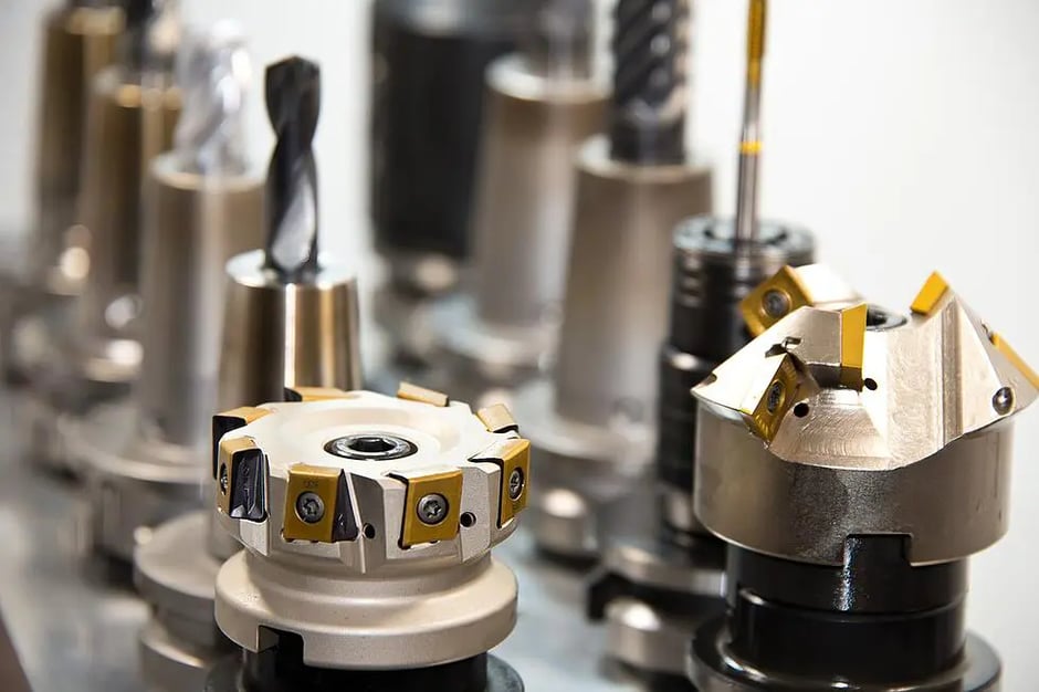
2. Use lots of images
Rather than adding images, videos, and other visual elements to your site after it’s published, incorporate them into your design.
Images of parts you’ve manufactured or videos of your machines in operation, for example, help potential customers evaluate the quality of your work and operation (and possibly close sales remotely, as Thomas points out) without the need to talk in person.
To this end, it’s best to use as many of your own images as possible, rather than relying on stock images.
Make sure the images you use are high-quality, compressed, no bigger than necessary, and the right file type. JPGs are generally best for photos, because they tend to slow down your site less, while PNGs tend to be used for illustrations.
Example: Madison Banders
When we designed the site for a company that creates commercial banding machines, we made sure to strategically include videos of the products (the machines themselves) at work…
Source: Madison Banders
… as well as photos of products that the machines had packaged.
The goal was to simulate a trade-show experience, combining video of machines with persuasive (and helpful) information, making it easy for potential customers to research machines before talking to a salesperson.
3. Keep the navigation simple
For the non-designers out there, site navigation refers to elements like site menus (or navigation bars), often stuck to the top (header), bottom (footer), and/or side of each page, that help you get around the site.
To ensure websites are easy for everyone to use, keeping your navigation as simple, understandable, and predictable as possible is key.
Here’s how to do this:
Use no more than seven categories in the main site menu. If you want, you can always add drop-down lists so people can get to subtopic pages within these categories.
Name each category very clearly. Label each group of pages on your site in a way that generally describes what the visitor will find there, without any room for misunderstanding.
Example: Briggs & Stratton
For example, Briggs and Stratton limits themselves to only five simple yet clearly labelled navigation items (including home) in its main menu, yet manages to fit many pages under each broad category.
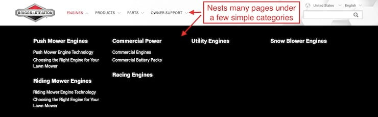
Source: Briggs & Stratton
4. Organize your navigation based on what would make the most sense for your visitors.
HubSpot recommends this exercise for deciding how to organize your site menu:
- Write the name of each page you want to have on an index card.
- Give them to a few people, along with a pad of sticky notes and a pen.
- Have them arrange the cards (pages) into whatever categories (nav items) they like, and label each category with a sticky note.
- You can use what they come up with to design your real-life site navigation menu.
Example: Superior One Solutions
We designed this Wisconsin machine shop’s navigation menu using the following principles:
- Answering the question “can you make my part?” (the root of every customer’s buying decision).
- Nudging users closer to requesting a quote.
- Making information as easy to find as possible.

Source: Superior One Solutions
After reading one of these pages, some visitors may be ready to request a quote, particularly if they are already familiar with the shop’s positive reputation.
These are followed by capabilities pages that go into greater depth for those who want to learn more about the machine shop’s equipment, tolerances, and more.
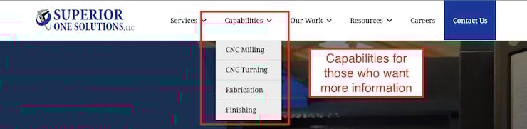
Following these pages, the “Our work” section contains pages that provide even more information about the shop and proof of both quality work and happy customers.

These include a gallery of example parts, an “about us” page, testimonials, and a page that describes the ordering process.
This is followed by less critical (but still important) pages such as a resources section for helpful content like FAQs and a careers page.
Finally, the contact us page—a critical site conversion point—is located on the far right and highlighted with a different background color than the rest of the navigation to help it stand out.
In this way, the navigation is designed to satisfy customers’ varying levels of research needs before they’re ready to contact the shop directly, and makes it easy for them to get a quote when they want it.
5. Make it easy to reach the most important pages
If a page is important, make sure it’s clear to the visitor how to get there. For example, your contact page should always be in the top menu of your site where it’s easy to see, because that’s one common way prospective customers ask for a quote.
One way to help prevent visitors from getting lost is by using breadcrumbs. Breadcrumbs are like a map that tells visitors which pages they passed through to get to the page they are currently looking at.
Breadcrumbs are helpful because they help orient the visitor to their location within the site, and often contain links to these previous pages, giving visitors the option to backtrack.
Example: Belden
Belden’s site makes use of breadcrumbs to ensure visitors understand where they are and can backtrack if necessary.

Source: Belden
6. Conversion options and calls to action should match your customers’ communication preferences.
“Calls to action” (CTAs) are clickable site elements (usually hyperlinked text or buttons with text on them that contain a link) that get your visitor to do something, like fill out a form or call you.
Clicking a CTA is often the last step taken by users before converting to a lead via your website, so they require a lot of design and copywriting mindshare.
To be effective in facilitating lead generation, CTAs have to be compelling to a potential customer on the site, so it’s a good idea to tailor them to your ideal customers’ communication preferences.
For example, if many of your customers are engineers in their fifties or sixties who care a lot about their privacy and prefer to do things old-school, your CTAs should reflect that.
Instead of asking them to fill out a contact form, maybe they would prefer to call you. In that case, a good CTA might be a simple phone number with a link in it they can call or click to call on a smartphone.
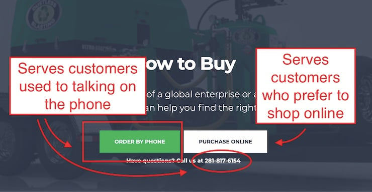
Example: Dustless Blasting
Dustless Blasting’s “how to buy” page tells interested visitors how they can buy its equipment. There are two CTAs for ordering by phone, suggesting that many of Dustless Blasting’s customers prefer that method.
One allows customers to see the phone number to dial, while the button allows mobile users to click to start a phone call automatically.
At the same time, there’s a secondary CTA that sends customers who prefer shopping online to their e-commerce site, likely serving a different segment of their audience.
Source: Dustless Blasting
7. Design your site with your industries’ aesthetics in mind.
A design that might look sleek and modern for a tech company might look out of place for a machine shop. Design your site to match your brand and feel familiar to customers who’ve visited other industry websites.
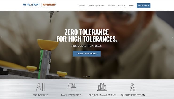
Example: Metal Craft Riverside
This machine shop’s website balances modern design aesthetics like ample space between page elements, concise text, and generous image use with choices that evoke machining, like brushed steel textures, photos from its shop, and mechanical icons.
Source: Metal Craft Riverside
8. Design your site around potential customers’ needs
Many manufacturers’ sites can read like a brochure, focusing on why a given machine shop is the best. While brochures have their place, designing a site that explains how your business can meet potential customer needs can actually be more persuasive.
The key is selling your products and/or services as solutions to customers’ problems, speaking directly to their challenges and concerns.
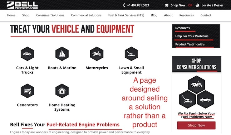
Example: Bell Performance
On this service page, this manufacturer positions its fuel additives and treatments as solutions to common limitations created by traditional fuel and engine types.
It even provides links to further resources to help potential customers learn more about the company, its reputation, and what specific problems customers may be experiencing (e.g., common diesel fuel issues).
Source: Bell Performance
9. Design a fast site
Your site should load quickly, particularly if your customers tend to live in areas with slow internet speeds or use mobile data networks to browse.
Achieving a page load speed of three seconds or less is the conventional rule of thumb. Otherwise, potential customers will get frustrated and leave.
Google itself has stated that page load speed, along with other factors that affect user experience, actually affect how high pages rank in Google search results.
Site speed is partially dependent on how your website is developed, but design and hosting choices can help make your site speedy as well.
As we mentioned earlier, making sure your images are the right size and file type is an easy way to lighten the load.
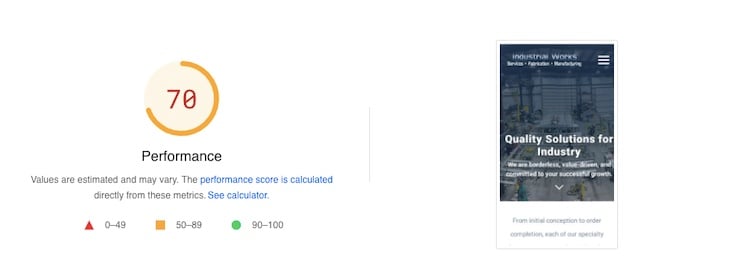
Example: Industrial Works
You can test your speed and diagnose problems by simply dropping the address to your website into Google PageSpeed Insights, which will give you an overall mobile and desktop speed score.
Industrial Work’s website scores very well on desktop. Its performance on mobile is also quite good.
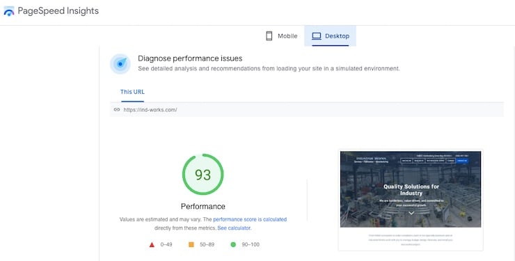
Source: Google PageSpeed Insights
10. Include essential pages
Most small business websites have these pages: home, about, contact, service and/or products pages. Thomas recommends these, as well as product catalog pages (if relevant).
Thomas also notes that it’s also good to have industry-specific pages, examples of work you’ve done, and an equipment listing page.
Example: Catalytic Combustion
Catalytic Combustion’s website includes all the major pages listed above, including industry pages.
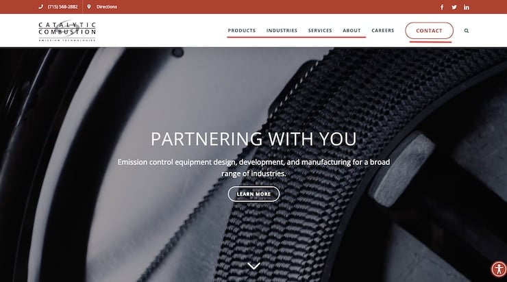
Source: Catalytic Combustion
11. Use social proof
Social proof refers to feedback from the outside world about your business, such as customers, your community, and members of your industry.
Common types of social proof used on websites include:
- Case studies
- Testimonials
- Awards
- Accreditations
- Counters (such as how many customers you’ve served)
Social proof is a great way to reassure potential customers considering hiring the business that it’s reputable, and others have benefited from partnering with them.
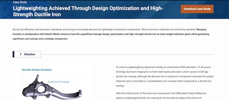
Example: Waupaca Foundry
Waupaca Foundry has an entire section of its website dedicated to case studies that showcase its work in various specialties, such as lightweighting.
This is great because it provides evidence that this business is experienced in a number of areas and has satisfied customers before.

Source: Waupaca Foundry
Visitors can read case studies on the site, or download a copy for later.
After scrolling to the bottom of the page, they have the opportunity to get in touch with the manufacturer, since people who are interested enough to read a case study are more likely to be ready to talk to a salesperson.

12. Great mobile design
It pays to design your site to look great on mobile devices.
In Q1 of 2021, almost 55% of worldwide internet traffic came from a mobile device. In fact, Statista notes that about half of internet traffic has been generated by mobile devices since 2017.
It’s also valuable to have a great mobile site because it helps ensure Google judges the best version of your site for search result ranking purposes. This is because Google typically judges your site based on its mobile version.
As a result, it can affect your ability to rank in search results.
“Responsive design,” is one way pages can become more mobile friendly. This means that your pages are made to automatically adjust to fit any screen size they’re loaded on.
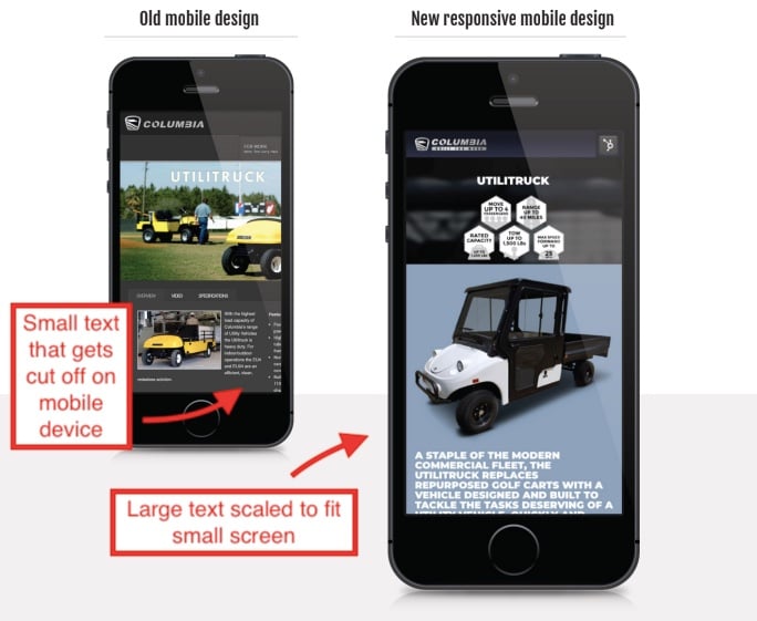
Old vs. new mobile site designs for a client; Example: Columbia Vehicle Group
Sites that are hard to read or have portions cut off because they don’t fit a smaller screen are bound to frustrate potential customers on their phones.
Bottom line: Potential customers on mobile devices may leave your site if it’s not good enough, and the calibre of your mobile site can have an impact on how likely your pages are to get seen in search results.
Example: TLX Technologies

Source: TLX Technologies

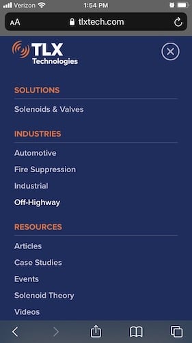
TLX Technologies’ site looks nice on both desktop and mobile devices. For example, in mobile view, nothing feels cramped or gets cut off. Text is readable. Call to action buttons are easy to see and click with your thumb, and the menu is easy to access and use.
13. Provide links to social media and review platforms
If your business is active on social media and/or has listings on prominent review platforms like Google Business Profile or BBB, it’s standard to display icons for these sites with links embedded in them on your website.
This makes it easier for visitors to leave your business reviews or interact with you on social media.
Social media and review site icons are often located in the footer (bottom portion) or header (top portion) of each page of websites.
Example: Kimberly Clark
For example, Kimberly Clark puts its social media icons with embedded links front and center in its site header without drawing too much attention away from the main navigation bar.
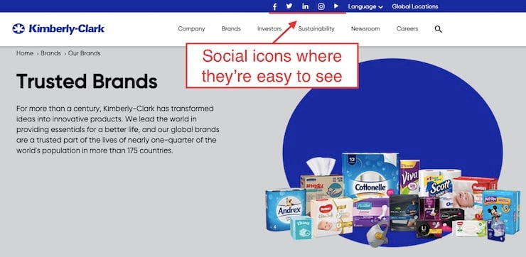
Source: Kimberly Clark
14. Use forms to generate leads
Provide a form on your contact page that allows prospects to ask for a quote or ask a question. Forms are helpful for customers because they’re a convenient and efficient way to communicate with the business, even outside of business hours.
Example: Redline Plastics
Redline plastics provides a quote form on its contact page so potential customers can get in touch on their own timetable.
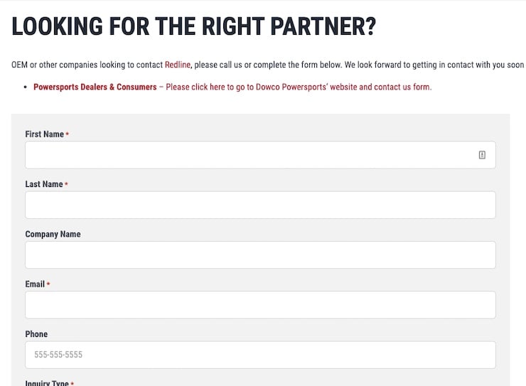
Source: Redline Plastics
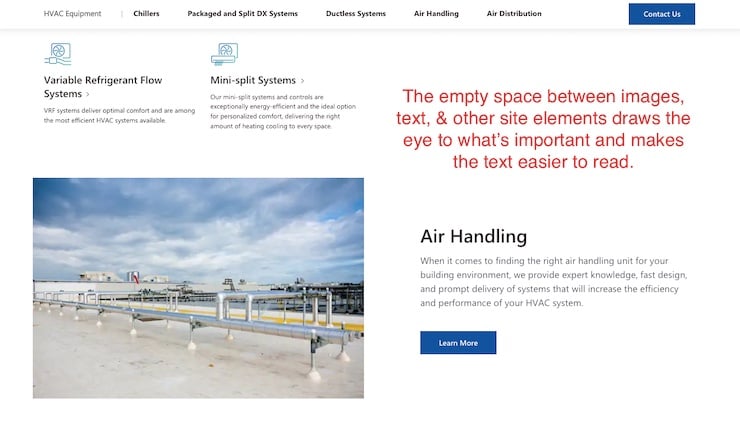
15. Use white space effectively
White space is blank space around site elements such as images or text. It helps draw attention to the most important elements of the design (such as calls to action) and helps to avoid visually “overloading” the visitor with too much too close together (HubSpot).
Example: Johnson Controls
The Johnson Controls website uses white space and contrasting colors to draw attention to important site elements, such as text and calls to action.
Source: Johnson Controls
16. Place CTAs strategically
In order to use your site to generate leads, it’s important to design pages in such a way that readers are more likely to click on calls to action.
For example, placing the CTA above the “fold” of a web page (the area that is visible before you scroll) where users are most likely to see it is one way to encourage visitors to convert into leads.
Example: Aermec
Aermec’s home page immediately presents visitors with two CTAs. One helps potential customers ready to talk to sales get in touch effortlessly. The other provides visitors who are still in research mode with additional information—all without having to scroll.

Source: Aermec
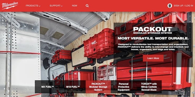
17. Keep branding consistent
It’s important to keep your style and branding consistent throughout your site, including your chosen fonts, colors, and illustration style.
Brand guides help you stay consistent. If you already have one for print, refer to it. If not, put one together.
As a general rule of thumb, use no more than five different colors on your website (M.G. Helander et al. via HubSpot) and no more than three typefaces (Worchester Polytechnic Institute).
Of those fonts, it’s a good idea to choose something that can be displayed by most browsers and computers and reflects your brands’ personality (e.g. serious, professional).
Example: Milwaukee Tool
For example, Milwaukee tool’s site consistently uses its red, black, and grey brand colors and helvetica neue typeface, which is readable, bold, and conveys a heavy-duty, no-frills personality to match its products.
Source: Milwaukee Tool
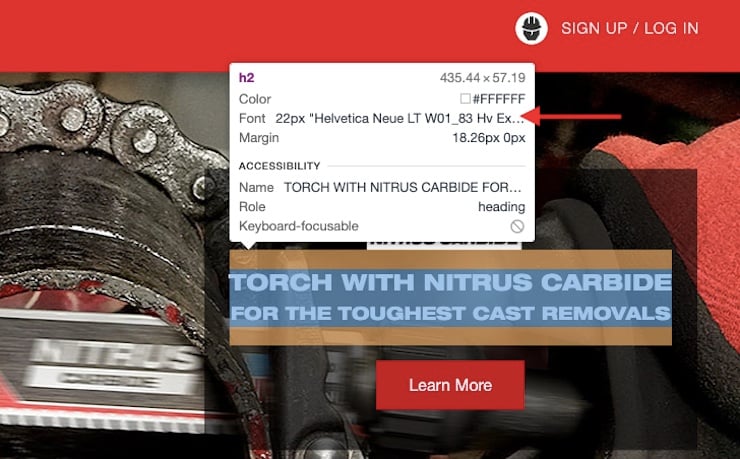
18. Great accessibility
Your website should follow Web Content Accessibility Guidelines (WCAG) to ensure it is accessible for users with disabilities. While you will likely have to check manually as well, you can use a tool like WAVE to identify many potential accessibility issues.
Example:
Sadly, it’s hard to find a site that doesn’t have at least a few accessibility issues. There are a lot of factors to consider, from providing great image alternative text (embedded descriptions of images that screen readers pick up) to captions for videos, to designing forms to fit all screen sizes.
This manufacturing site has a lot of problems, such as low-contrast text, which makes words harder to read, particularly for individuals with vision impairment.
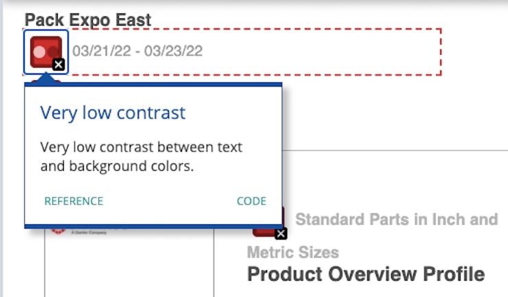
Source: WAVE
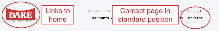
19. Meet common web design conventions
Your navigation is one place where originality is not a good idea. It’s better to give site visitors what they’re used to. It’s generally a good idea to:
- Put the most important categories on the left side of your navigation (often with the home page link furthest to the left)
- The next most important ones in the middle
- The contact page link furthest to the right, which is standard.
It’s also standard to place the main navigation menu at the top or side of the page and provide a clickable logo in the top left corner of your navigation bar as your home button.
Be consistent in other areas of the page, too. For example, underline links in text.
Example: Dake
20. Flat, or “semi-flat” design
According to the Interaction Design Foundation, flat design is “a user interface design style that uses simple, two-dimensional elements and bright colors.”
In other words, flat design elements don’t give the illusion of depth by using techniques like shading that make a flat image look more three-dimensional.
The Interaction Design Foundation notes that flat design was developed so that web pages could load fast while scaling themselves to fit different screen sizes.
Due to these advantages, it’s become a popular approach to designing websites.
However, these days, designers tend to take a more balanced approach by incorporating a few strategic three-dimensional effects, such as gradients or shadows when they make a website easier to use.
Example: American Roller Company
With the exception of a subtle shadow behind the heading letters & the video behind them, every element on the page below appears flat, down to the illustrations, which are just simple icons.
Source: American Roller Company
Conclusion
These best practices should give you some idea of what’s involved in the design of a website, but it only scratches the surface of what’s involved in building a professional-looking lead generation platform.
While you can do a lot with a website builder like Wordpress, creating a high-quality website takes time, and you will likely need a skilled developer, copywriter and designer to get polished results.
Great websites are usually built by specialists who know how to code a site efficiently to function smoothly, write copy that motivates your target audience to buy, and design that makes your site pleasant to use and effortless to navigate.
Need a great modern site to generate leads for your manufacturing company

Topics: Website Optimization